
VOGUE RUNWAY
Image Archive
Vogue Runway’s entire archive available to browse: a powerful business tool for those in fashion, and Conde Nast’s first AI-powered search.
Image Search within the Vogue Runway app was one of the most used features. How might we bring parity to web?
Role
Senior Product Designer
Key stakeholders
Vogue Editorial
Product Manager
Engineering
Content Design
Ads
MarTech
App audit
Evaluating the current app experience and analysing data formed the inital baseline for this project. Features included: open text search, filter by brand, season, type and location, the ability to change the grid, and zoom.
The challenge(s)
01 More design system constraints to consider on web
02 Search page templates exist, but they do not consider this use case
03 Web users are not the same as app: how might we educate users?
04 Catering for ads which do not exist on the app
Reviewing existing templates and components
Across brands on web, there were existing options for “search” page templates and filter components. I audited these potential options and explored how these could work for the Image Archive.
Initial Explorations
I tested existing components and templates, collated competitive research and explored quick ideas across both desktop and mobile to answer questions such as: which tool is the primary focus? How might we show the user their results? How much help does a user need to understand this tool? What might help the user sort through their results?
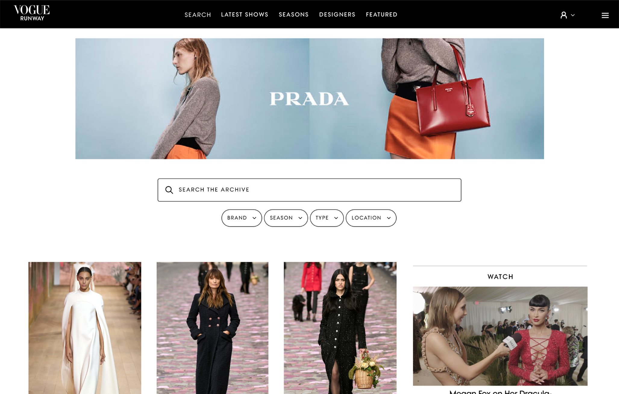
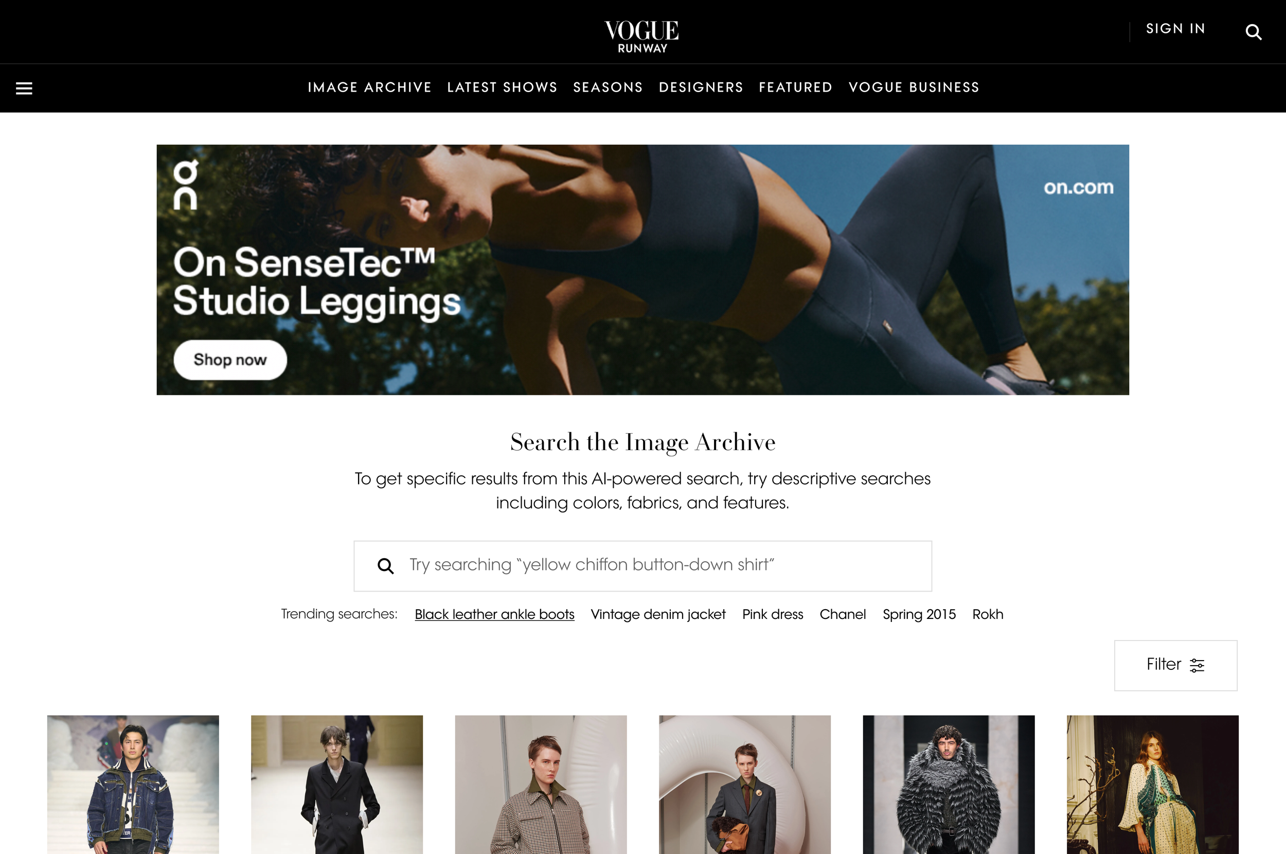
It became clear that the Image Archive would be more of a “tool” than typical search pages, particularly for business users, and ideally, I could maximise visible results by removing the right rail of ads on desktop. Engaging the ads team, the compromise here was keeping the hero ad. Desktop real estate was of maximum value on this project, as Runway users often skew towards desktop devices for business use.
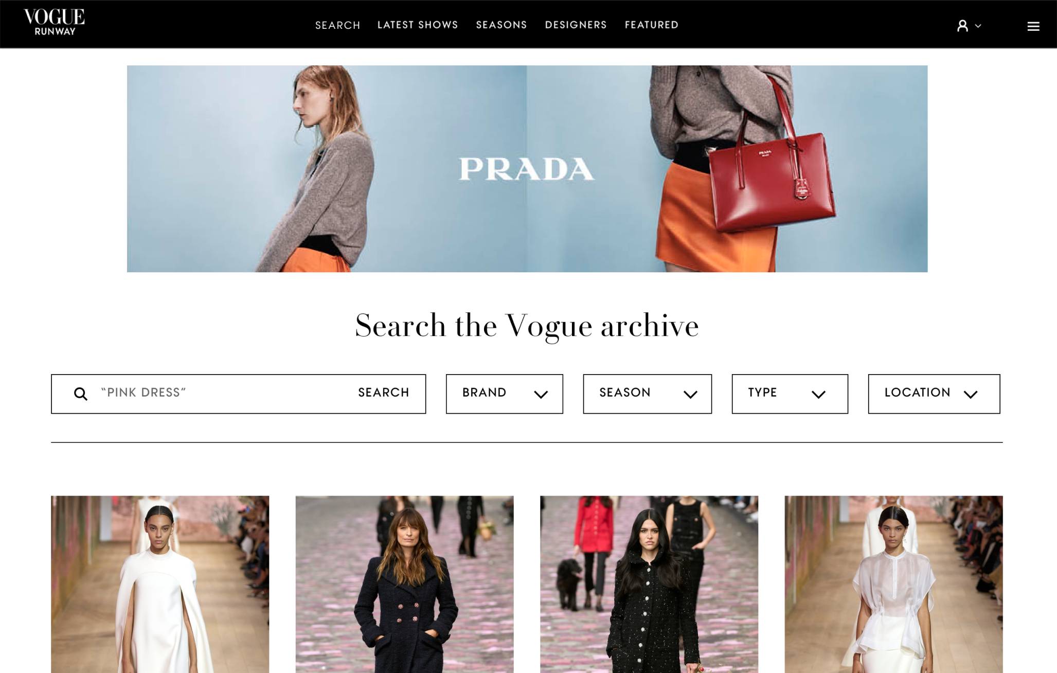
Search
The business deprioritised Open Text Search for MVP due to delivery constraints.
This meant revising the initial designs and focusing on filters only. App would remain the only platform with Open Text Search, for now.
Revised explorations
Option 1
Align closely to the app
This shows as many filters as possible in the viewport
…but those filters feel quite small for mobile web, and “location” would always be hidden from view.
💭 Can we use “search” in the title if users can only filter for MVP?
Option 2
Align to commerce patterns
Introducing one filter button which opens a modal is a familiar pattern from many retail sites, and allows users to see all available filters at once.
It still presented a few questions:
💭 Does this create an extra step for the user?
💭 Users cannot see any updated results behind the modal
💭 This would require separate mobile and desktop designs, increasing development time
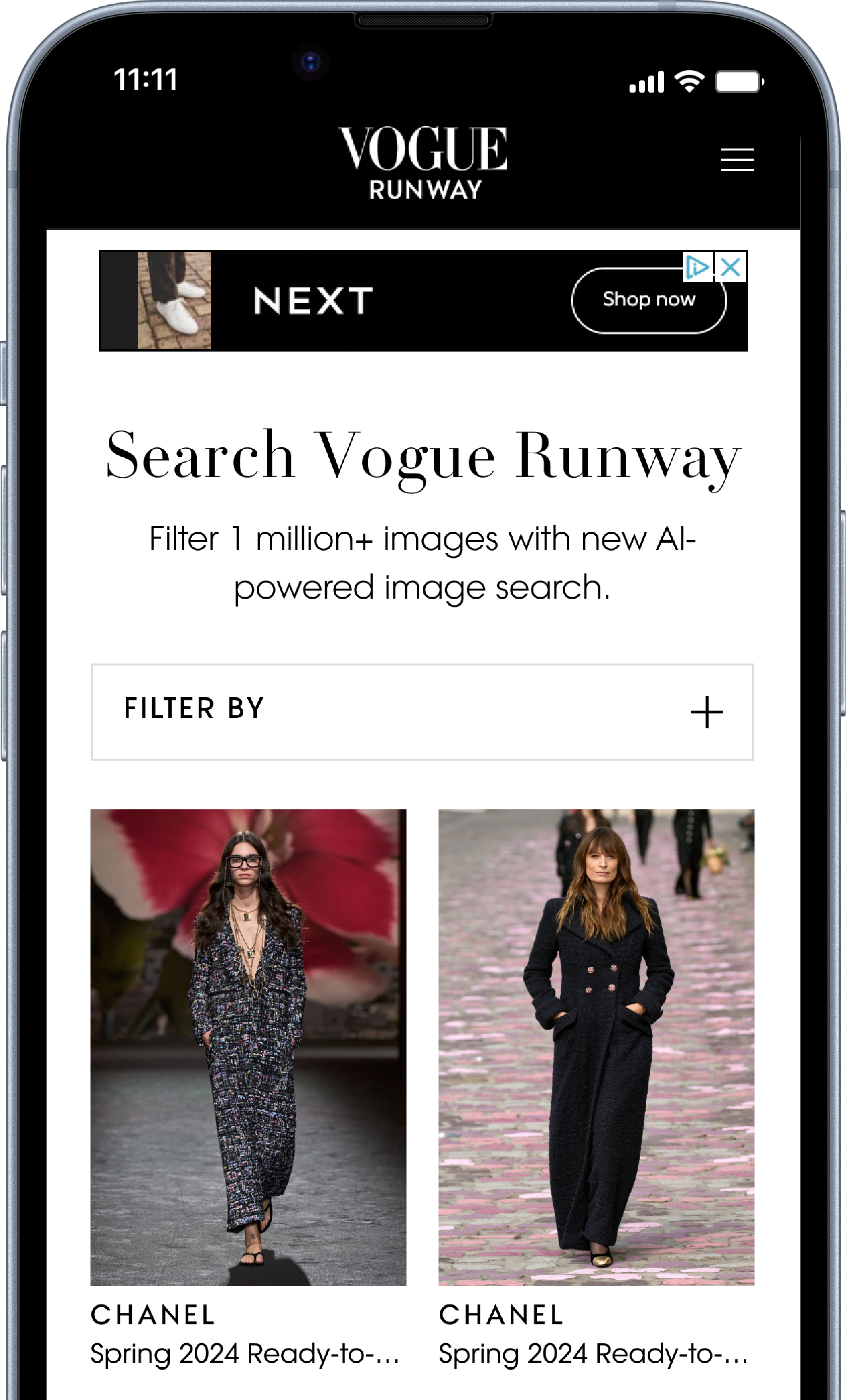
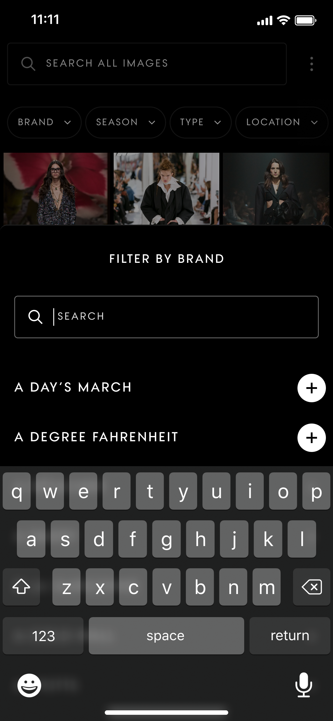
Option 3
Align to the design system
This would reuse existing web drop down components within the design system, which worked on desktop but in this exploration, shows how much of the view port is taken by filters alone, before users see any Runway images.
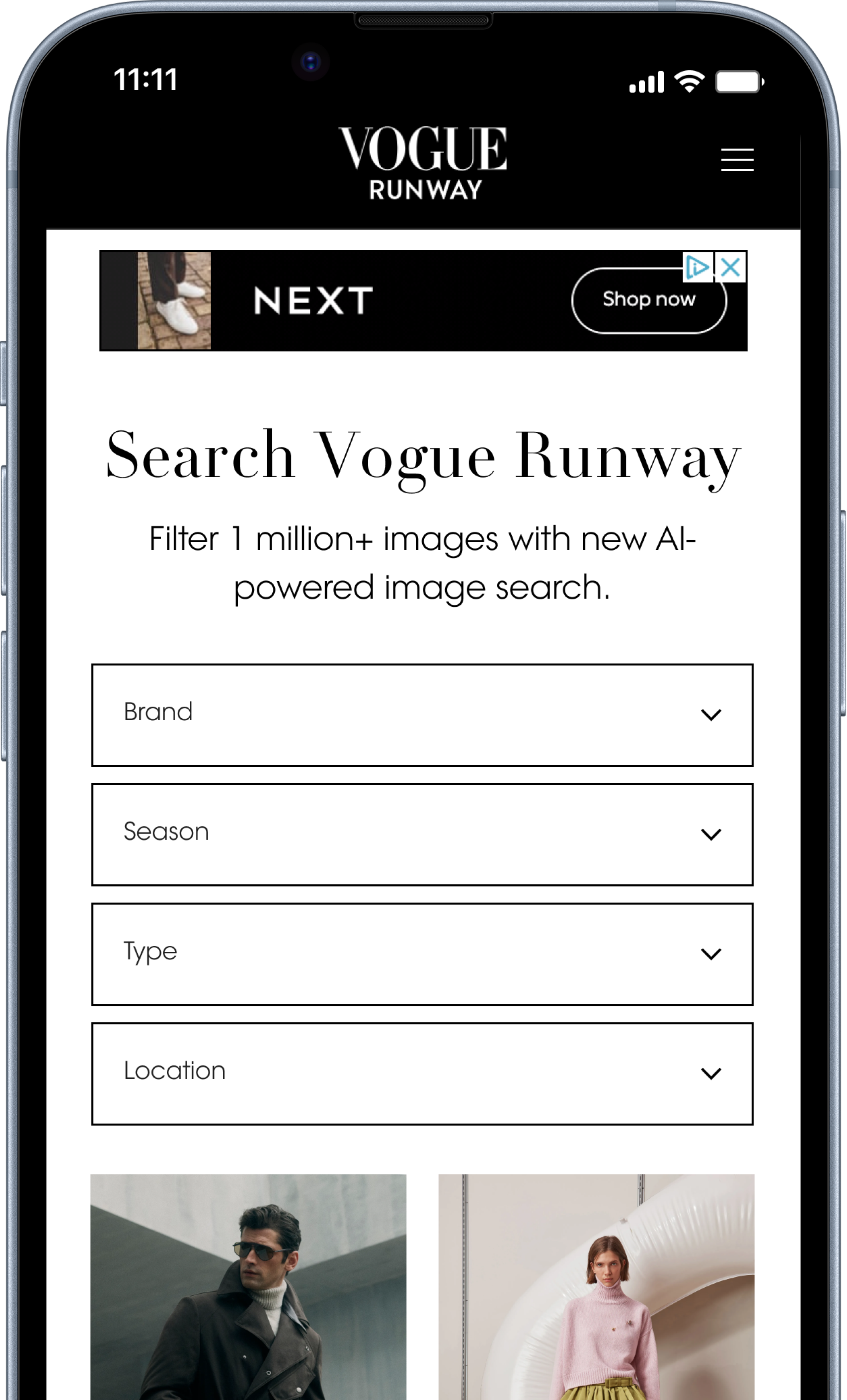
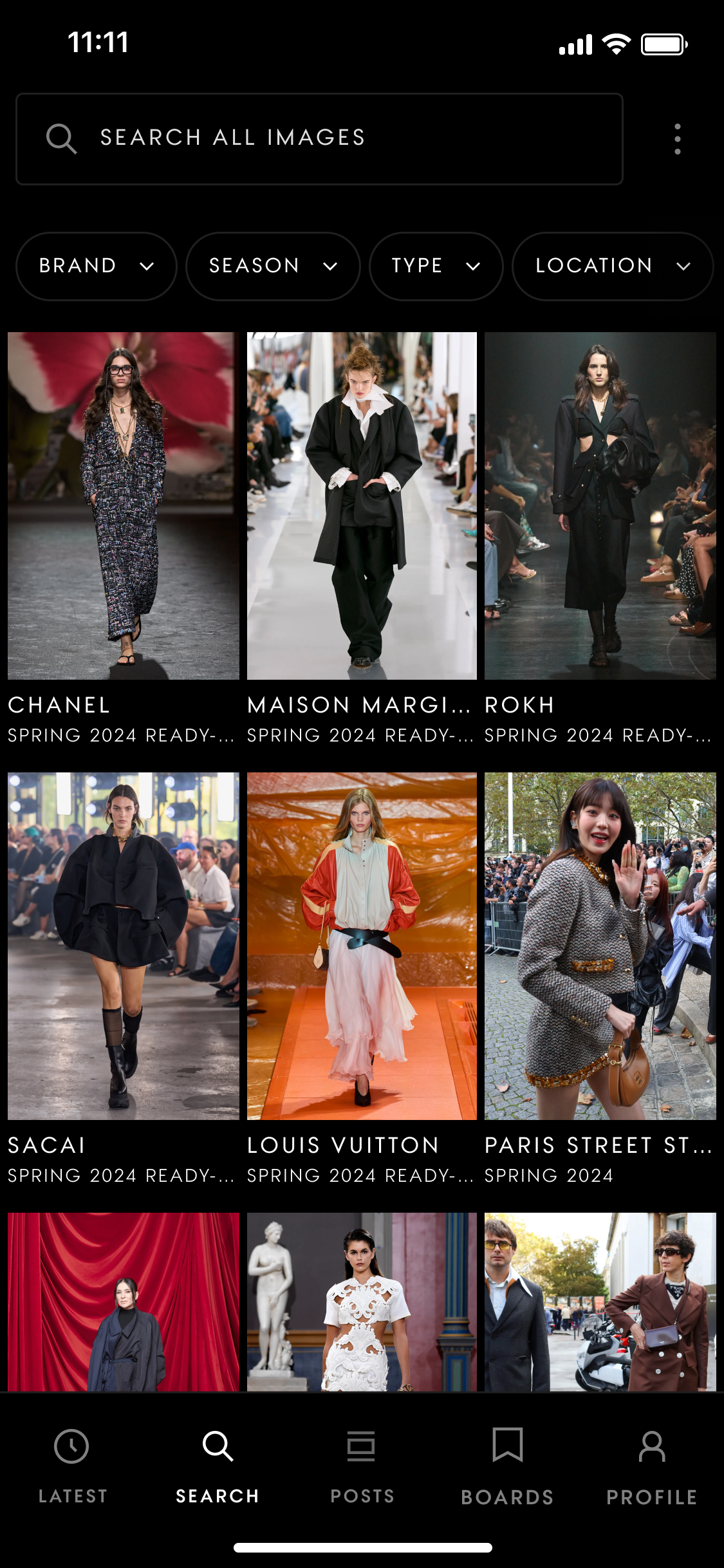
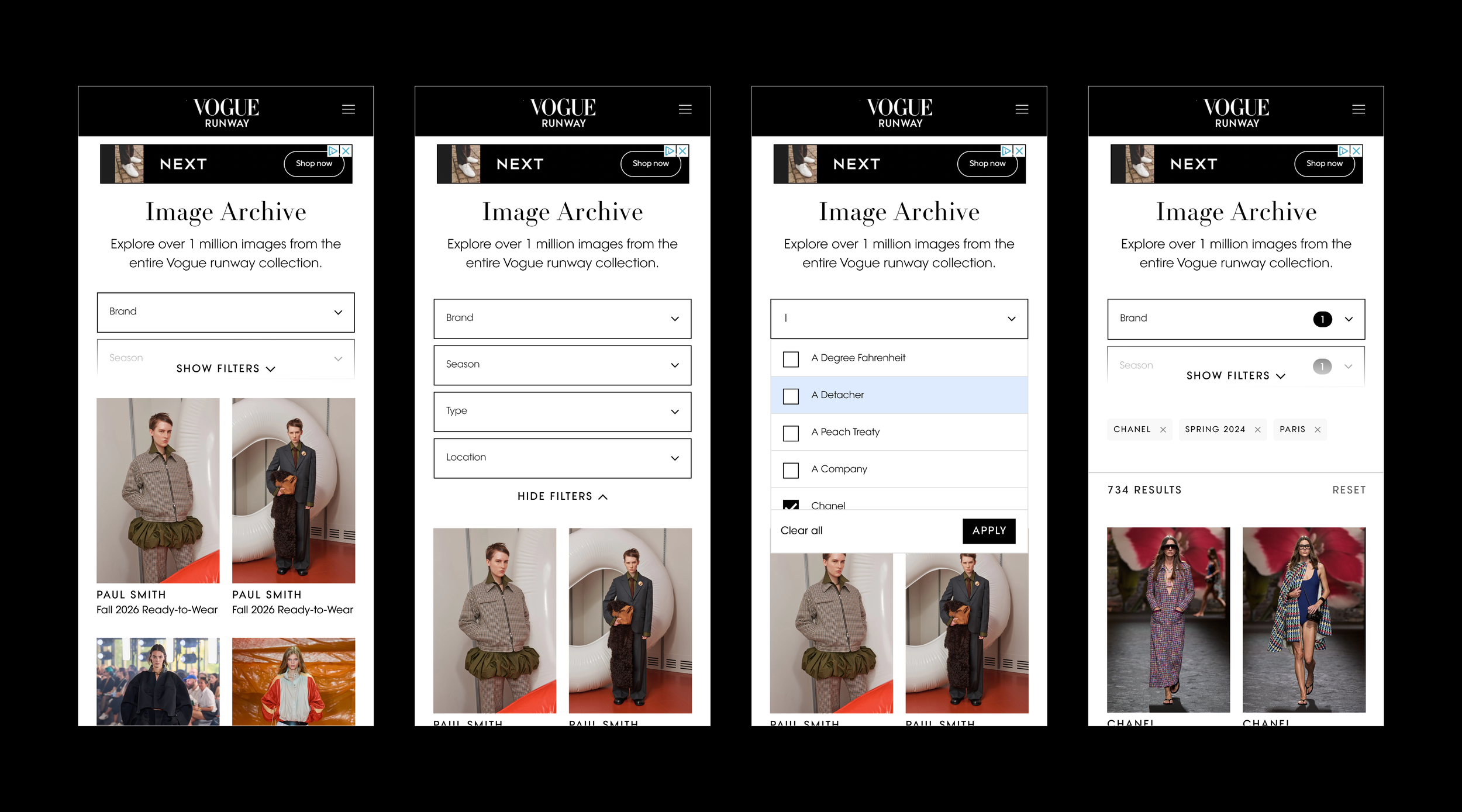
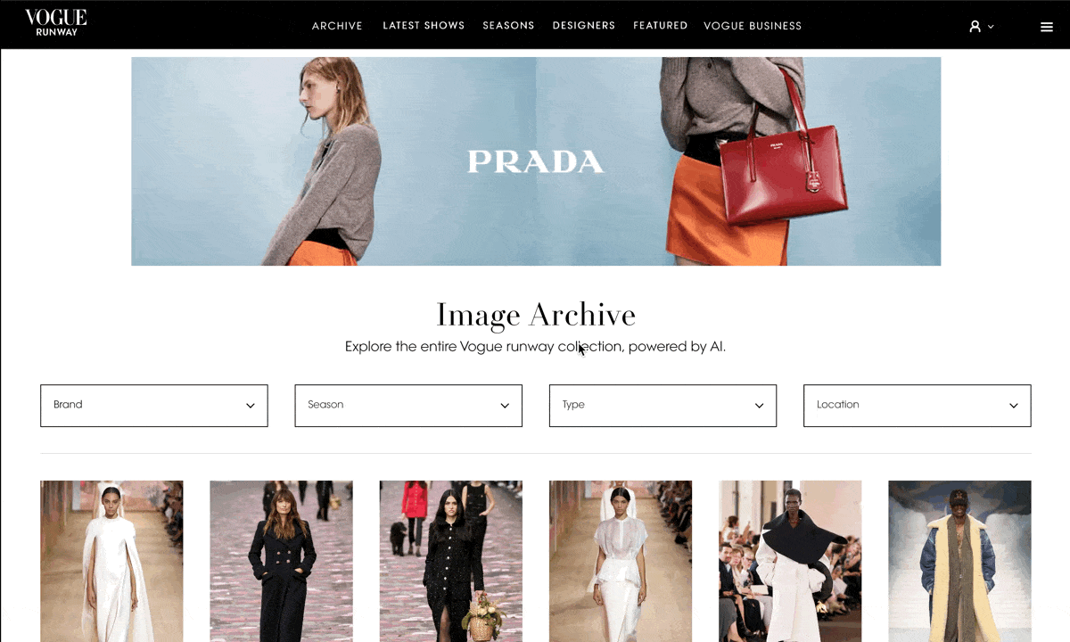
Image Search Archive
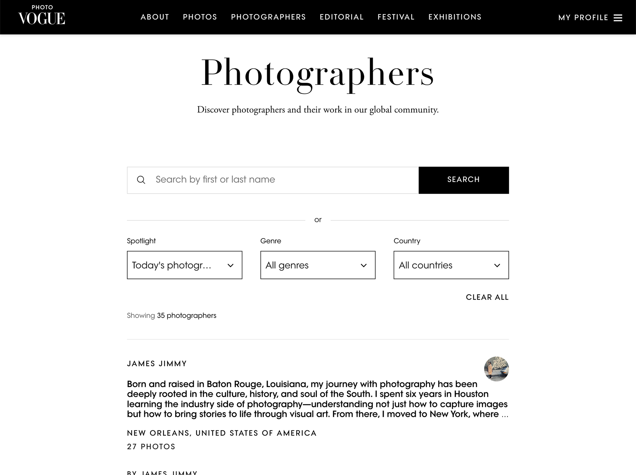
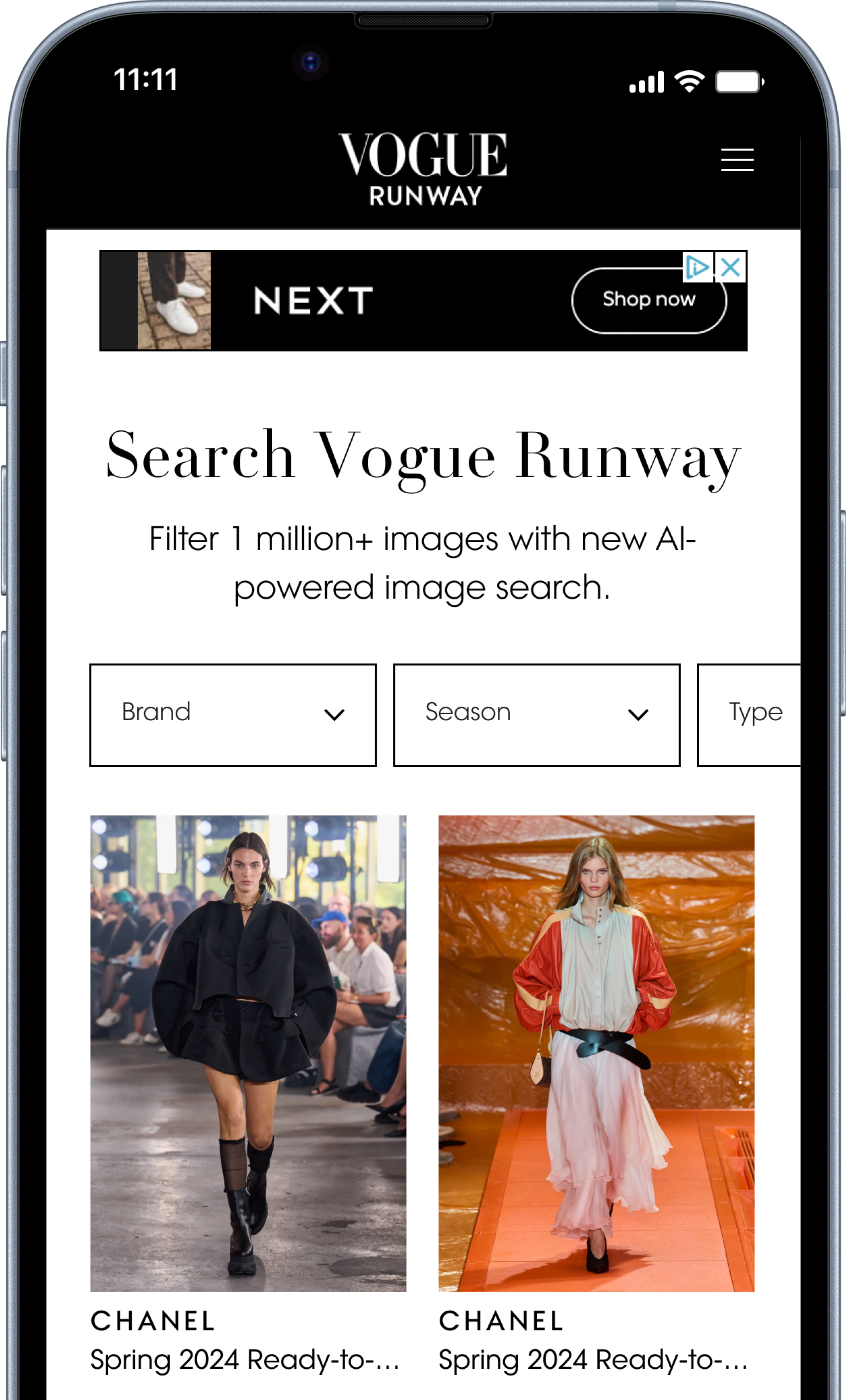
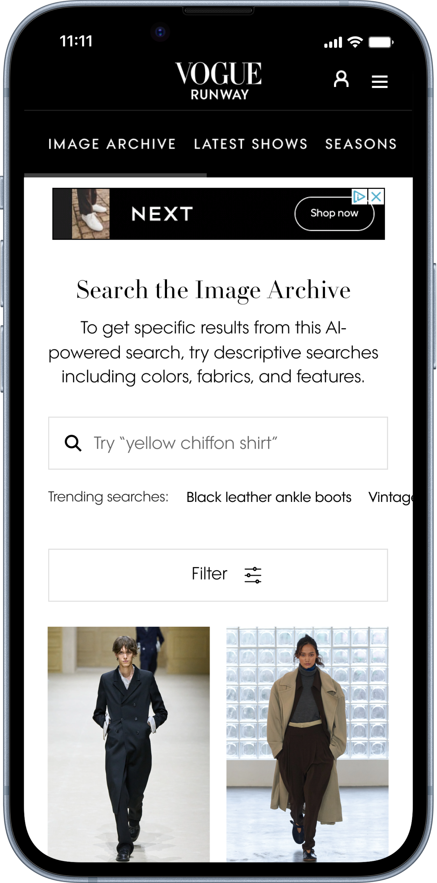
A new name
“Search” wasn’t technically going to be possible on web: HMW prepare a better name that sits well both on the page and in the site navigation?
Working with Content Design, I workshopped options and steered stakeholders to finalise the new title “Image Archive”, which reflected the depth of the Vogue Runway image archives, without suggesting open text search. This also sat well in the Runway navigation, and was placed first to ensure visibility on mobile and distance from existing site search.
Refinement
After engaging multiple teams, option 3 was taken forward as it aligned with the existing component, reducing development time and allowed a familiar interaction to users on both desktop and mobile.
The next step was to find a way to optimise mobile, keeping filters as the priority, but allowing users to see the Runway images when landing on the page too.
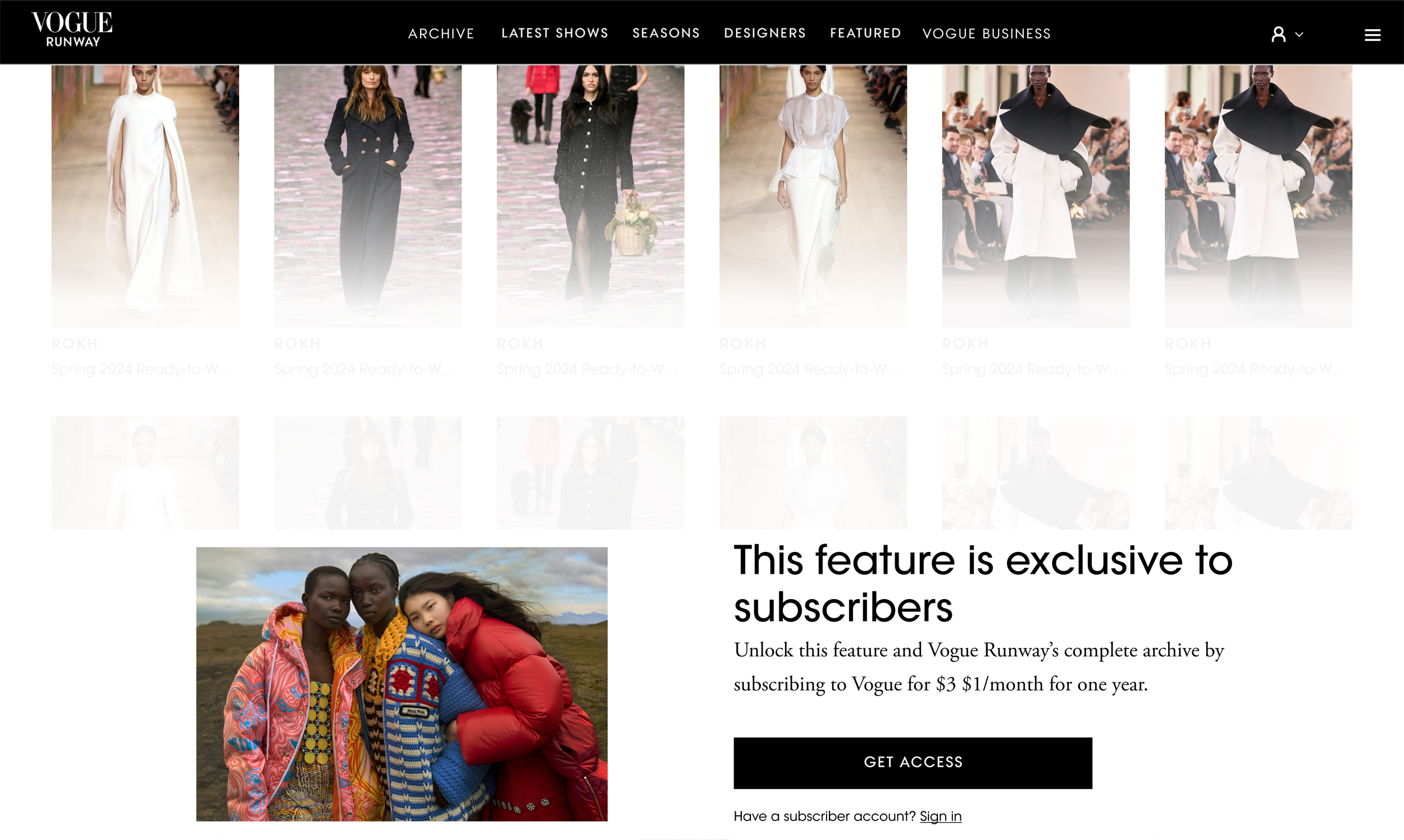
An updated paywall
The existing paywall component would block all interaction and scrolling on the page.
To help educate users on this tool, and encourage subscriptions, I proposed a new experience which allowed users to scroll to a certain depth, and open the filters, without being able to select anything further. This required close collaboration with the marketing and subscriptions teams.
Working with Content Design, we enhanced the paywall copy to be relevant to the image archive page, and create a clear difference between the on site registration gate and paywall, which use similar designs.
MVP release
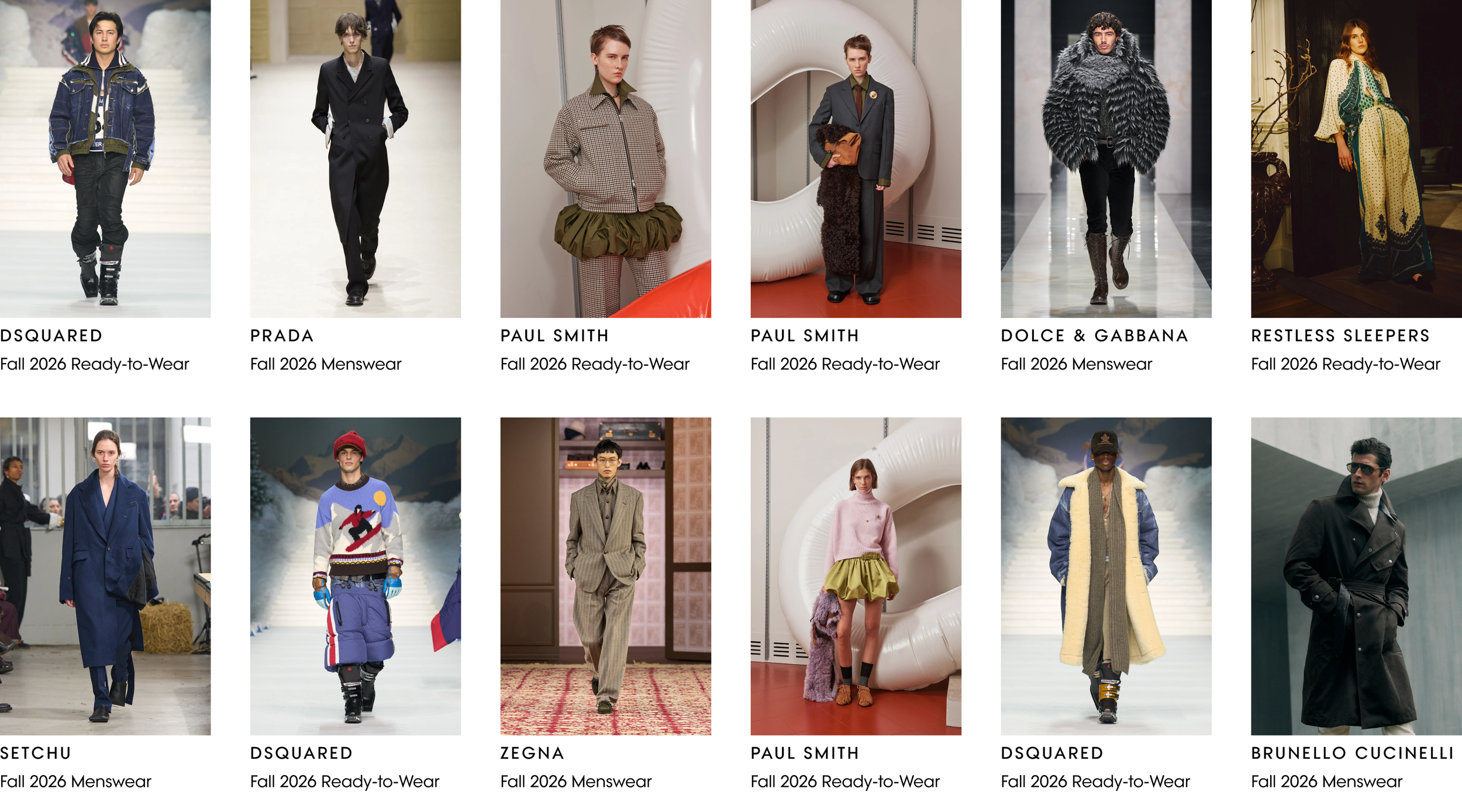
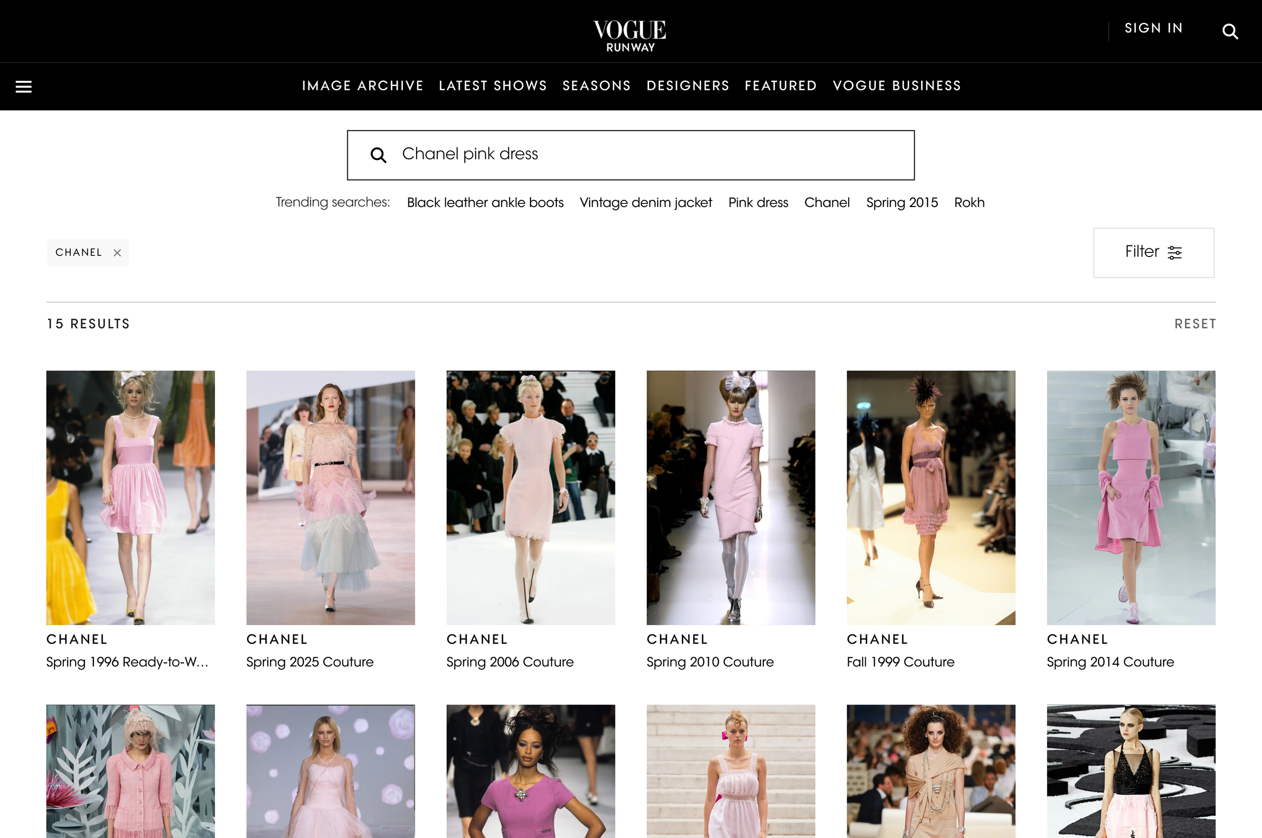
Image Archive V1 was released in Summer 2024, using a new image listing template. The right rail of ads was removed, and 6 images spanned the full width of the viewport on desktop. This built upon the existing 4-across Product Listing pages, to allow maximum results to be shown to the user as they searched.
Users could filter over a million images. The release of this new feature received:
✅ High conversion, above average on site
✅ High interaction with all filters
✅ High return rates
Iterative improvements
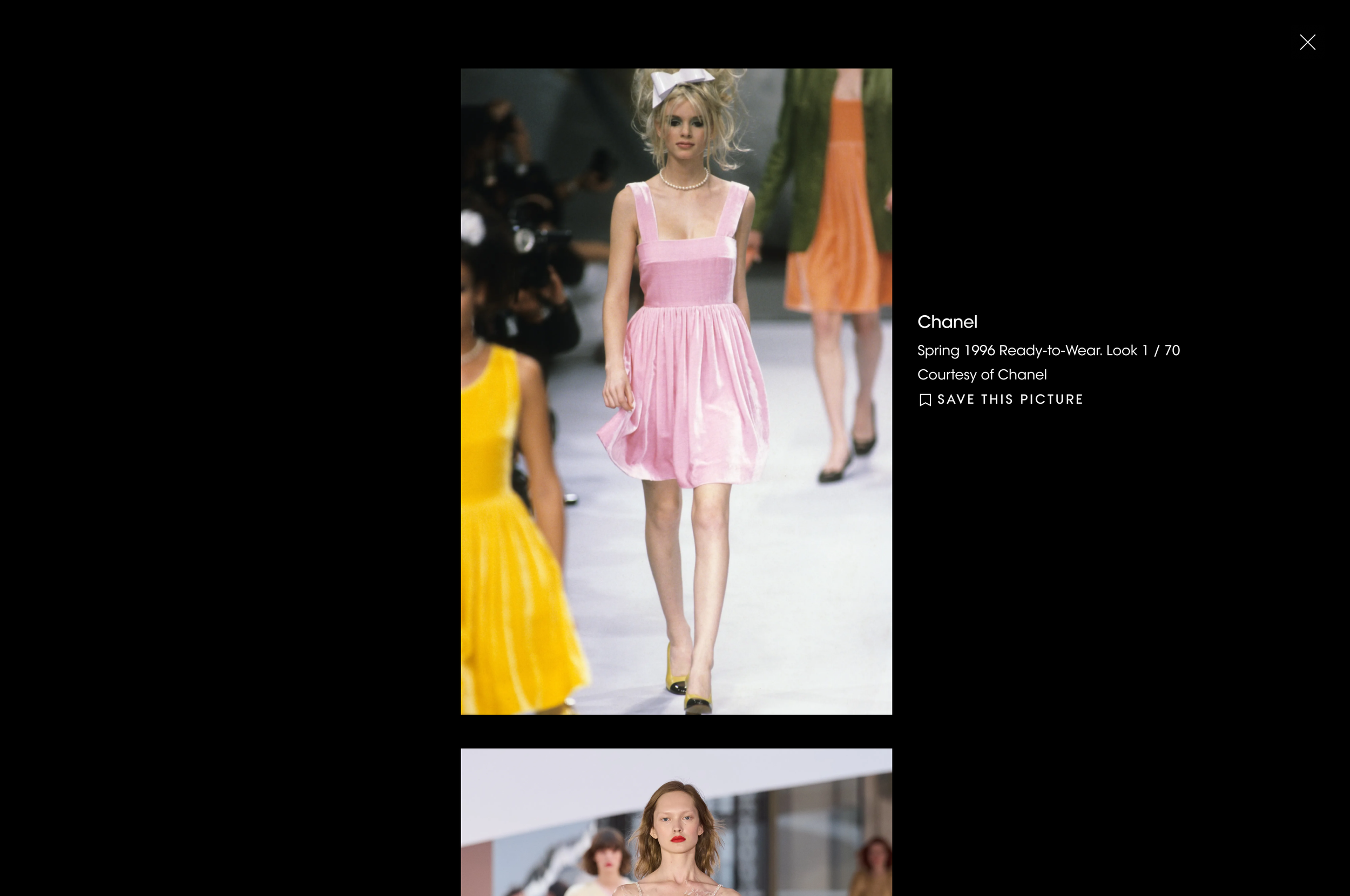
Lightbox improvements
To create a consistent image viewing experience across web, I aligned with multiple teams across the Vogue experience. Having previously designed and delivered the image lightbox for users saving images to their account, this was implemented within the Image Archive too, and later evolved, to allow users to scroll through images within the lightbox across both saving and Image Archive experiences.
Skeleton loading
While MVP reused an existing loading spinner, I wanted to pursue a clearer indication for users that new images are loading once they have filtered or searched.
V2 release
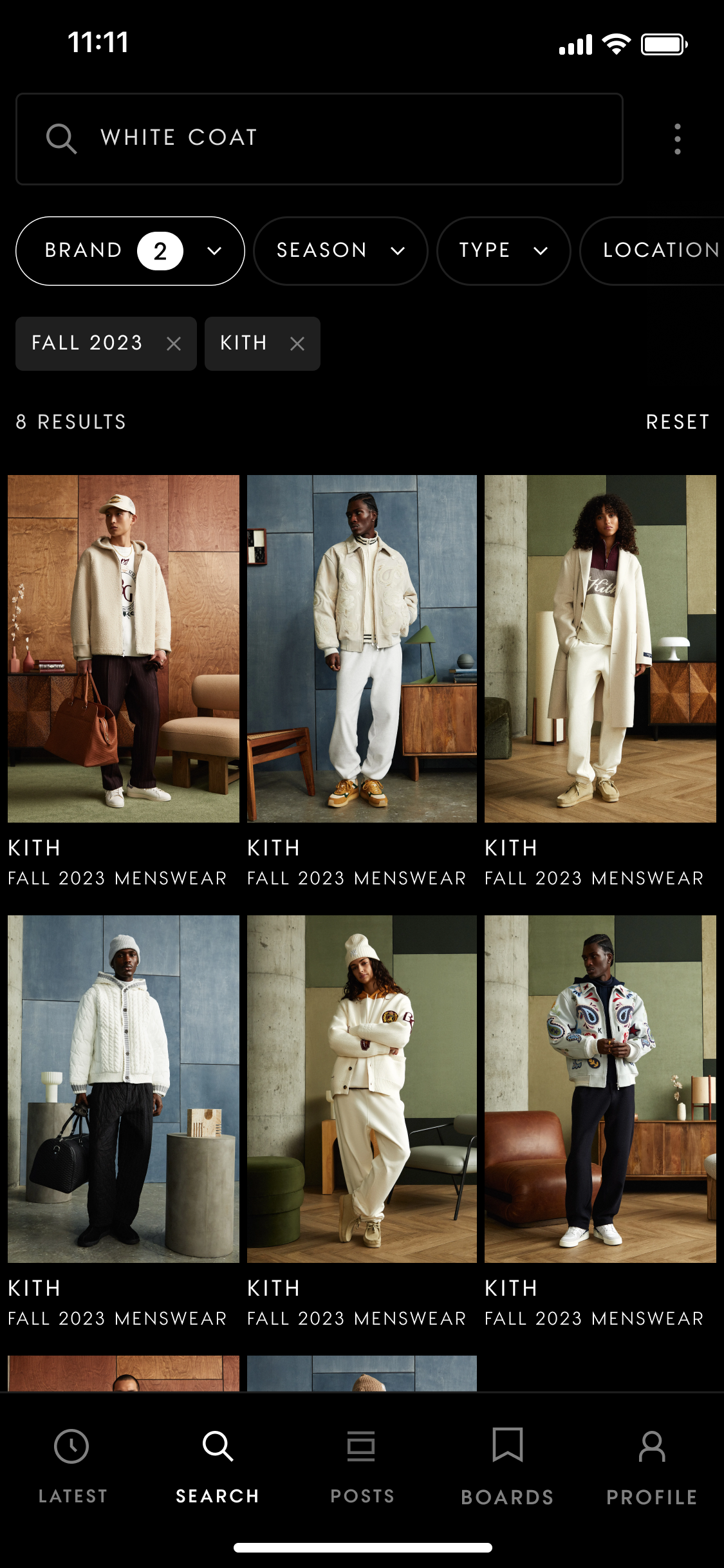
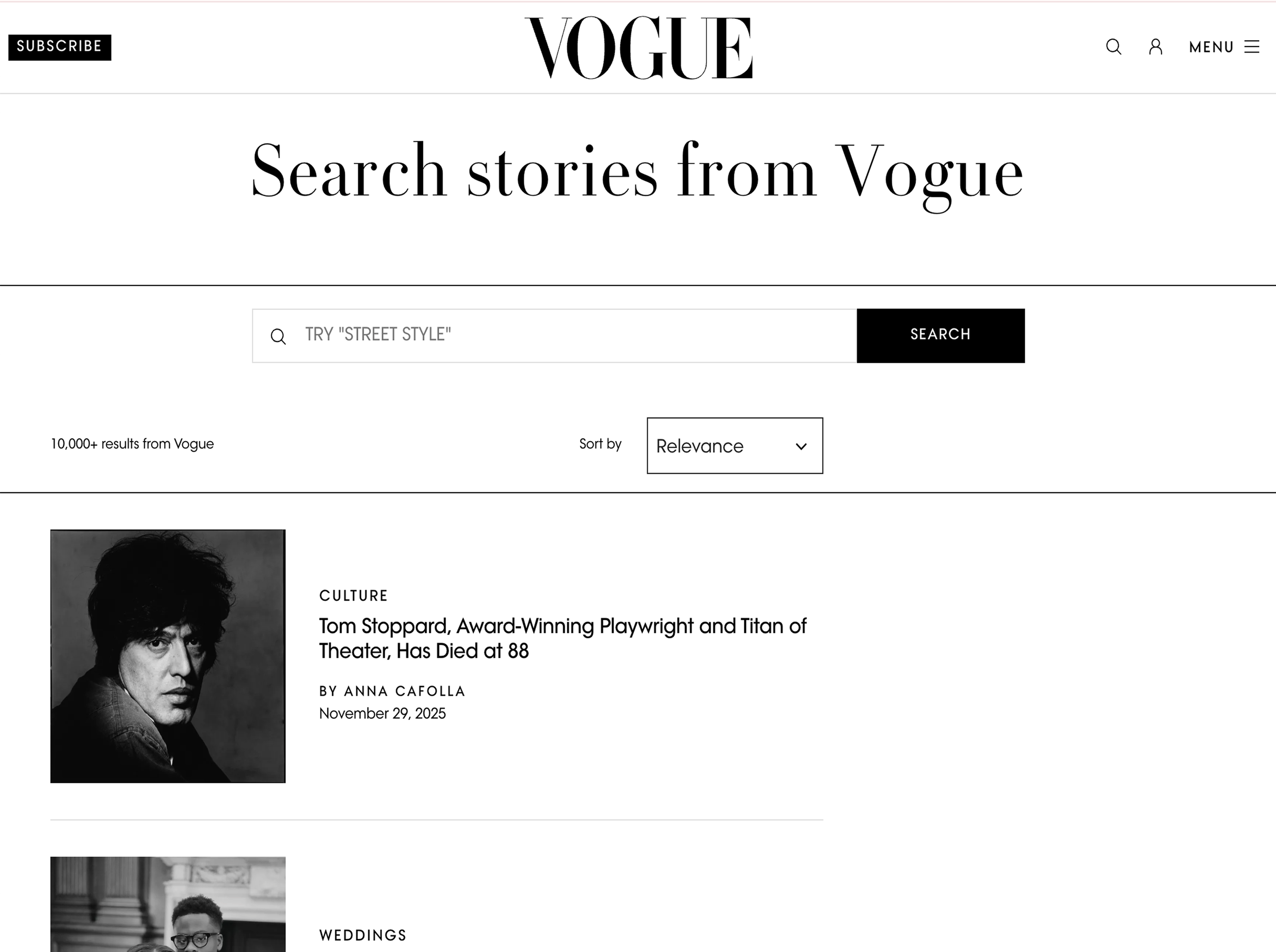
AB Testing: Open Text Search
With the high engagement of filtering on V1, open text search was re-prioritised.
While filtering proved popular, a key part of my design explorations getting the page hierarchy right: directing the user to search first, the more powerful tool. Due to this change in functionality, open text search was initially released as an AB test, with the filters hidden behind a CTA. This test quickly proved successful and open text search was rolled out to 100%.
Trending searches
When introducing Open Text Search, I found many competitors prompted the user with search ideas, including trending queries, products or similar items. In this instance, I wanted to help the user understand the types of searches that were possible, and inspire them to try editorially led ideas. Within the search field, the user is prompted with ideas for search terms, and underneath the field is a list of editorially curated searches and filters to inspire.
Initially, as part of the AB test, trending searches were always the same when a user refreshed the page. In a later release, we were able to add this to editorial workflows meaning each time a user refreshes the page, five trending searches are chosen from a pool of 35 to keep the user inspired, and these are changed seasonally.
*It’s still behind the paywall!
The results
01 Image Archive was the top converting page on Vogue Runway, proving the value of this tool
02 Users found results faster through Open Text Search, but time spent remained one of the highest on site
03 Strong, repeat engagement
04 Open Text Search allowed users to be more specific with their searches
05 Average time spent bookmarking increased, particularly in fashion months: users found relevant and inspiring images through the Image Archive
06 Trending searches received high CTR, which only increased once they changed upon page refresh.