BURBERRY
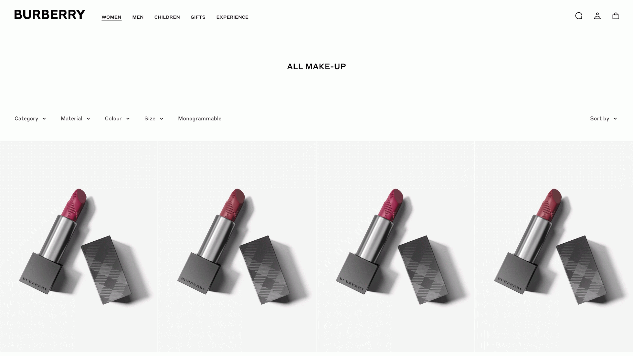
Optimising Filters & Facets
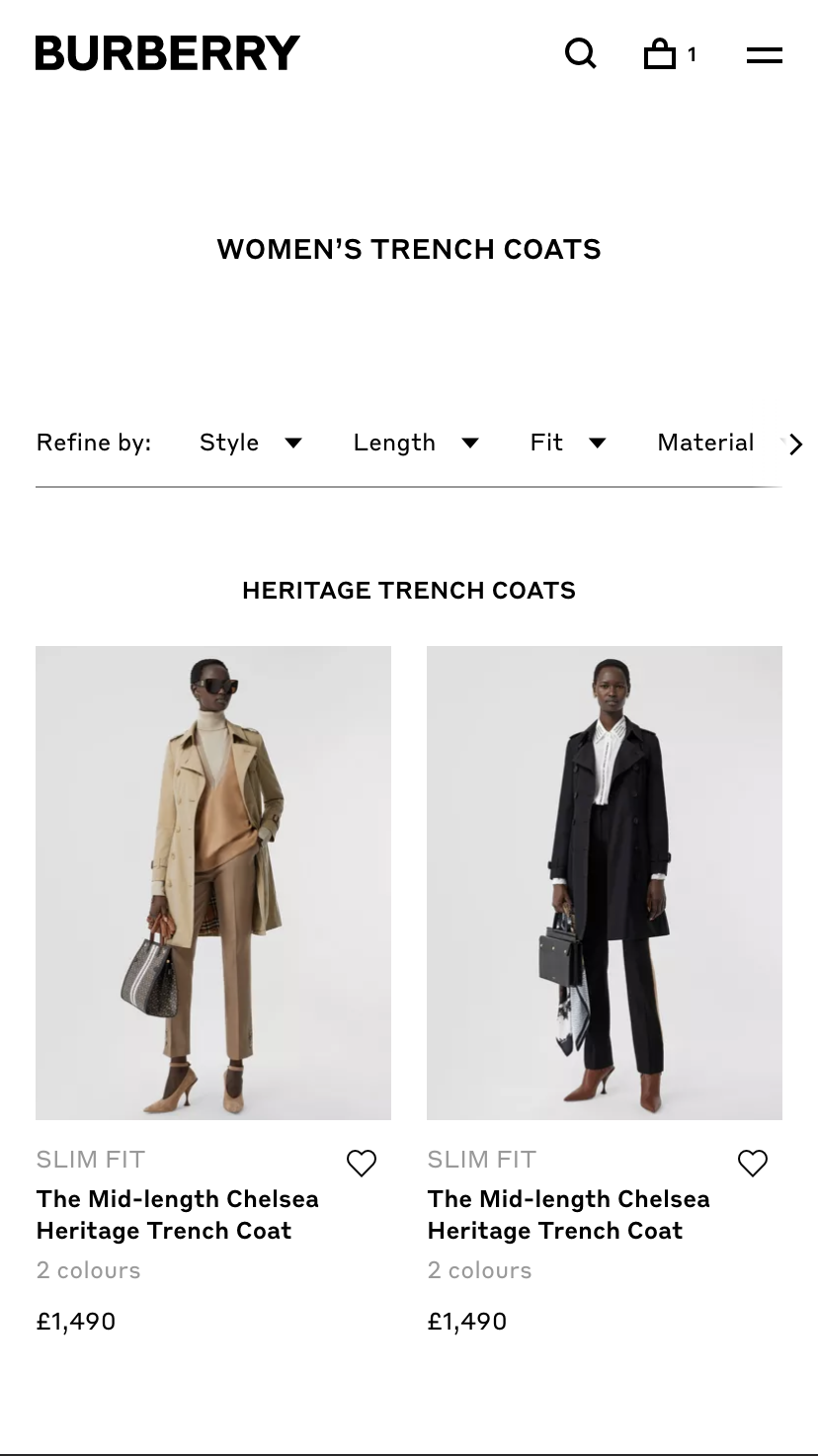
As part of the website replatforming, the brief was to optimise the current adaptive filtering experience on Burberry.com, making it responsive, and drive more Product Listing Page (PLP) traffic to purchase.
Role
Product Designer
Key collaborators
Product
Engineering
Analytics
Merchandising
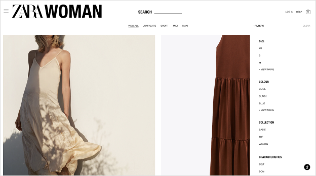
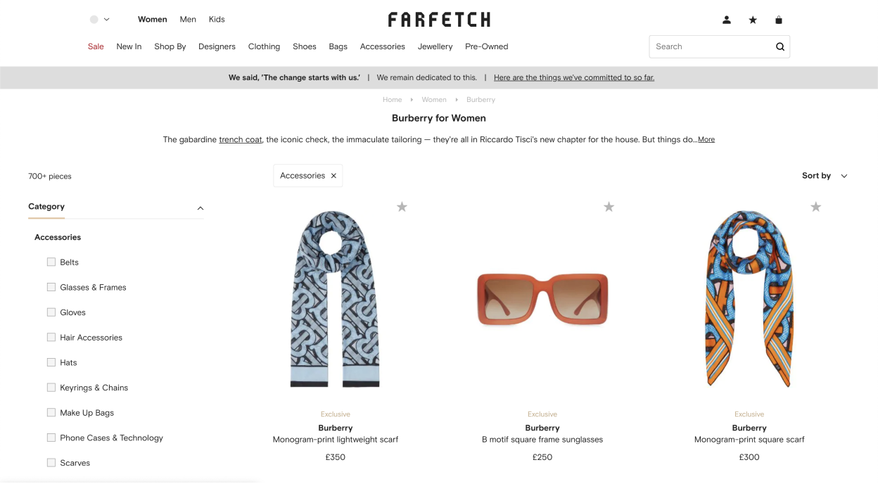
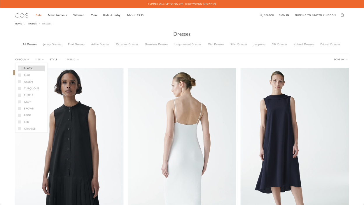
Reviewing competitors
I analysed competitor sites: looking at how they worked; the differences between mobile and desktop; and the design.
Using this research, I created a list of principles to test before creating concepts for the new filter functionality.
What about the users?
I needed to validate the principles I’d defined.
I set up several user tests, prioritising mobile sites as the majority of our traffic comes from mobile devices, but looking across all breakpoints. I wanted to understand how users shop, how they find things if you take the search tool away and how far they narrow their search if they’re looking for something specific.
“I like that they’re collapsed so I can just go in
and out.”
“I felt like they could be easier, as it’s a new page – I wish there was a way I could just click in and filter what I want. I think opening a new page is a little more time consuming.”
“I filter if I know exactly what I’m looking for. If I’m browsing, I want to see it all.”
“I do like everything being in a drop down menu so I can see everything and don’t really have to scroll.”
“This site is making me do it one by one, so it seems like it’s going to take a long time.”
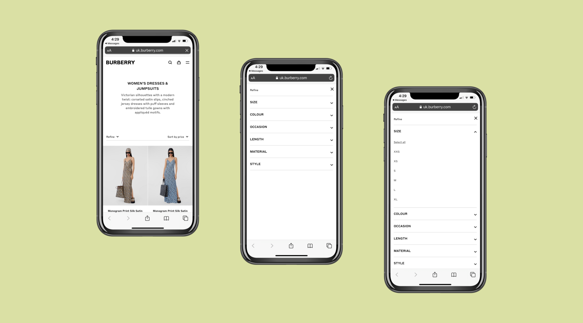
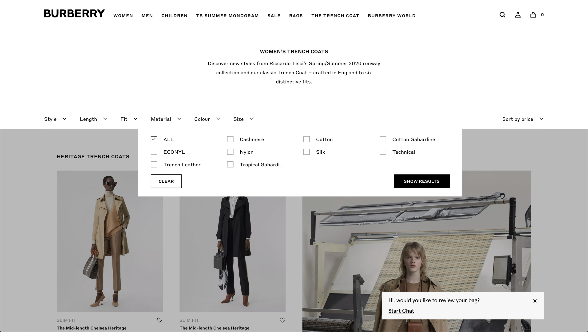
“Because it’s covering about 75% of the page, you don’t really see what’s updating behind it.”
Not forgetting our customers
Using ContentSquare to gain insight into Burberry’s most popular filters: I looked and tested our current filter design to understand how behaviour varies between desktop and mobile, which pages filters are most used, I created a starting point for the new designs.
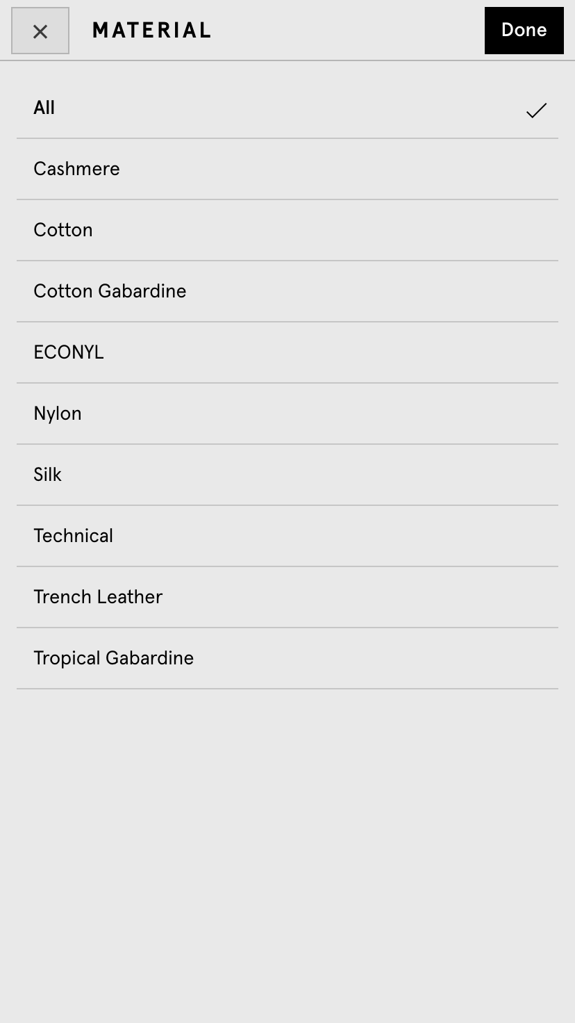
Initial concepts and improvements
Based on my research findings, I created 4 possible hypothesis and concepts for new the filter design.
01 Exposing most-used filters first will get customers to relevant products quicker
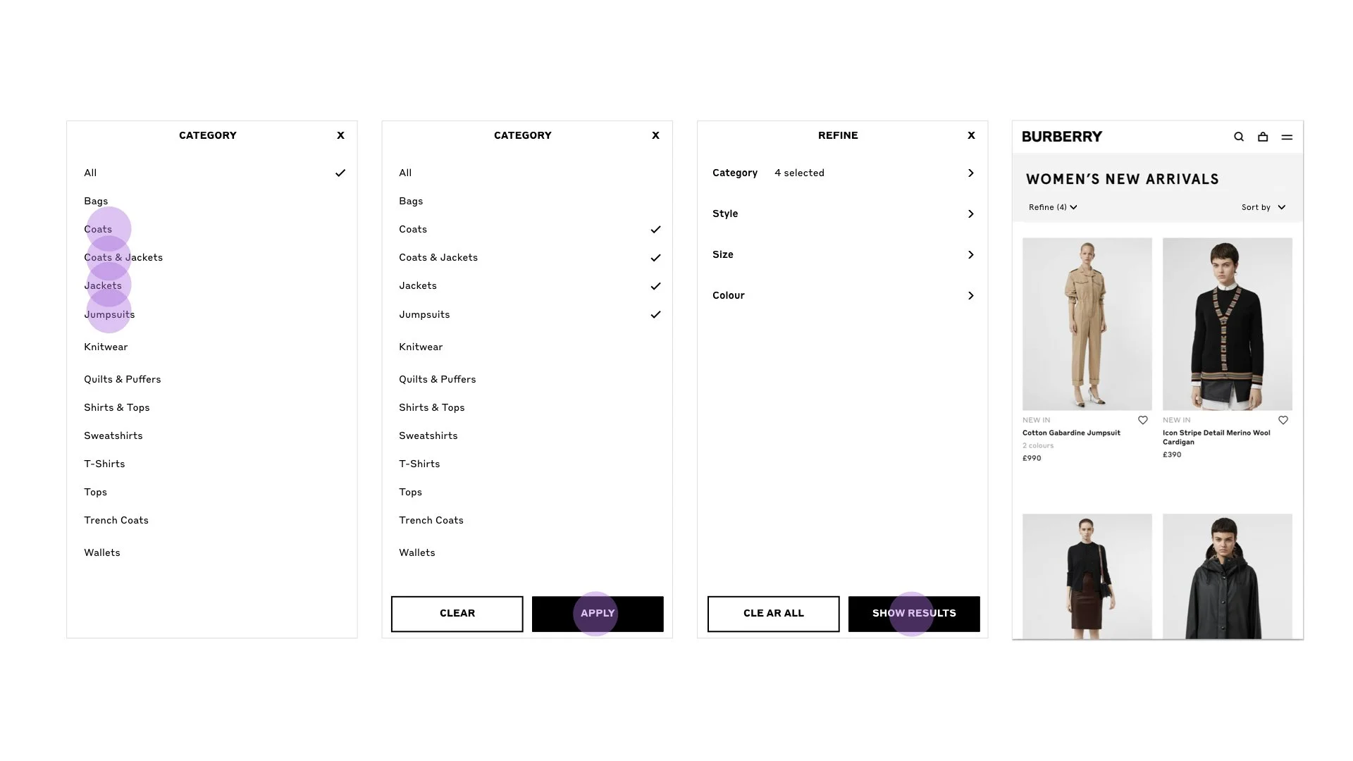
02 Changing the way selecting ‘all’ works, will make it easier for customers to choose multiple facets to filter with
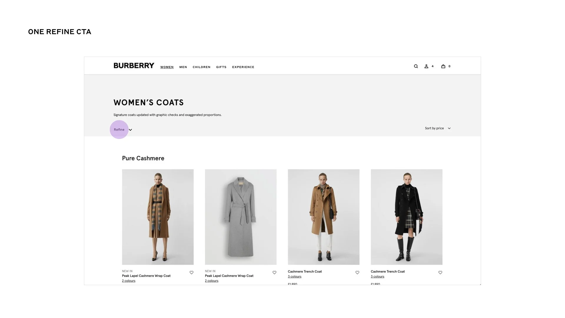
03 Creating one CTA for “Refine” will present a clearer call to action for the customer
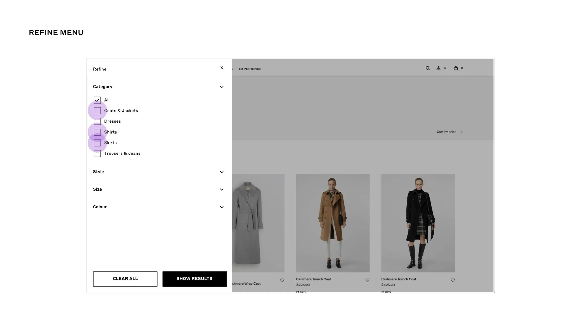
04 Using one filter page (with expanding facets) will help the user understand context quicker and appear quicker to use than separate pages
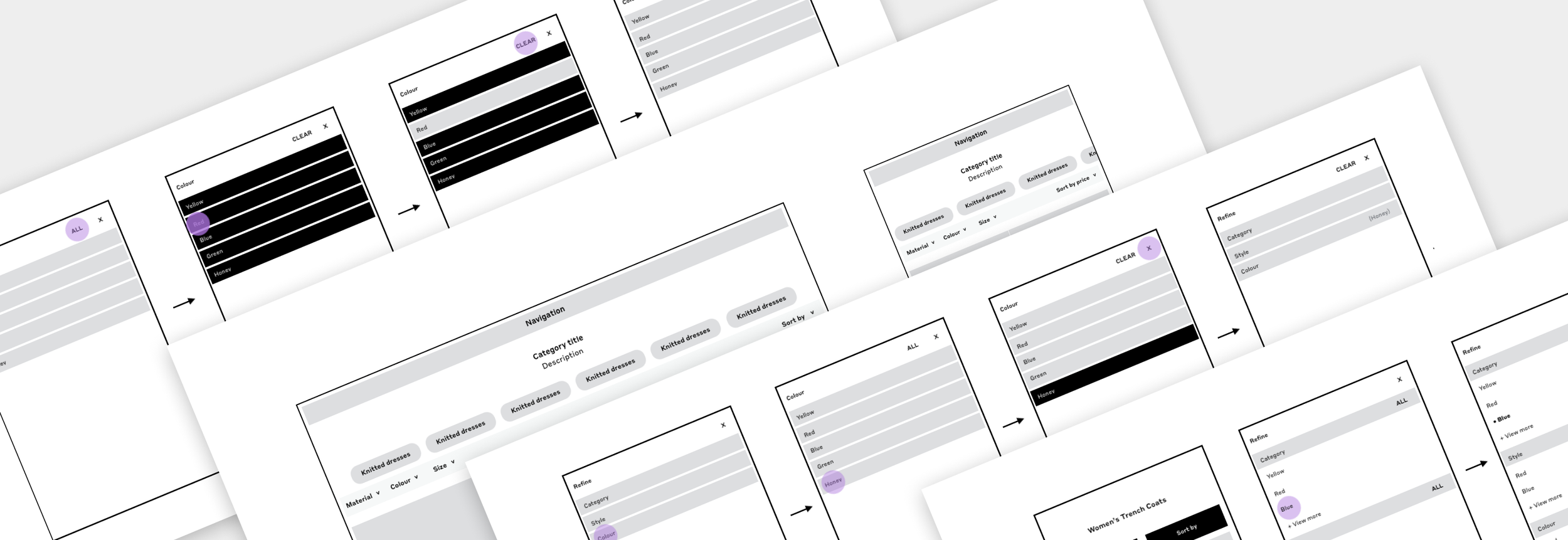
Prototyping, testing and iterating
Guerilla testing the initial concepts to prove and disprove my hypotheses, I was able to prioritise which changes to our current filters would provide most value for MVP delivery.
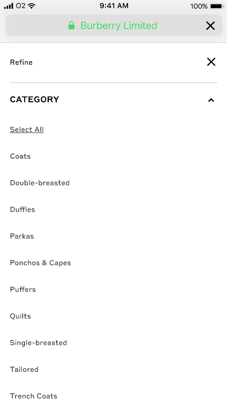
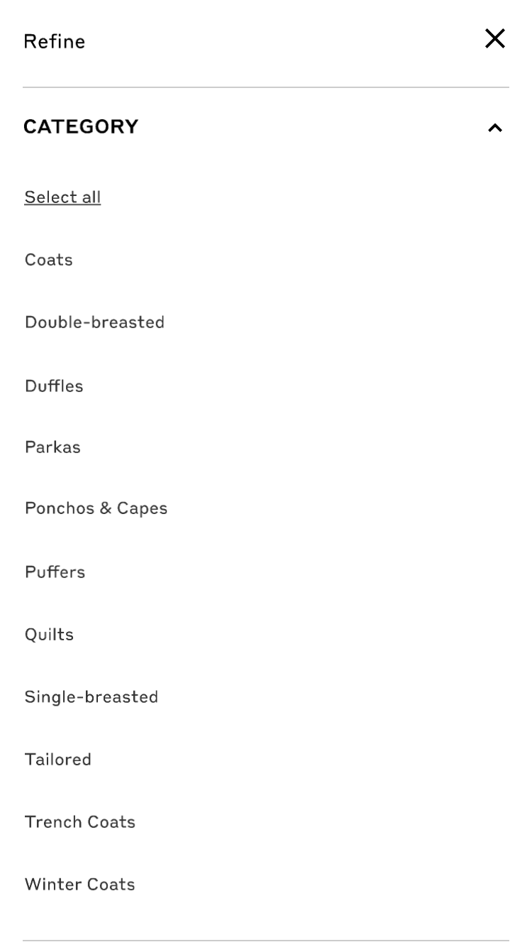
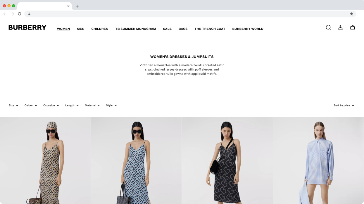
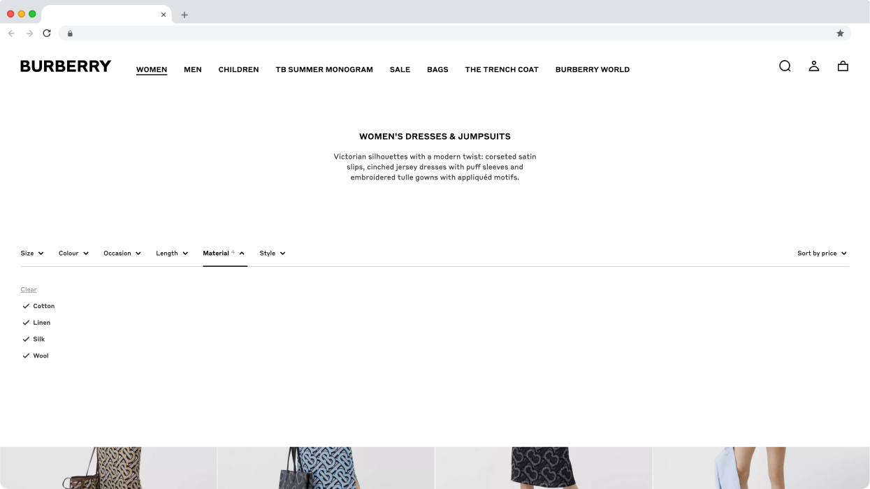
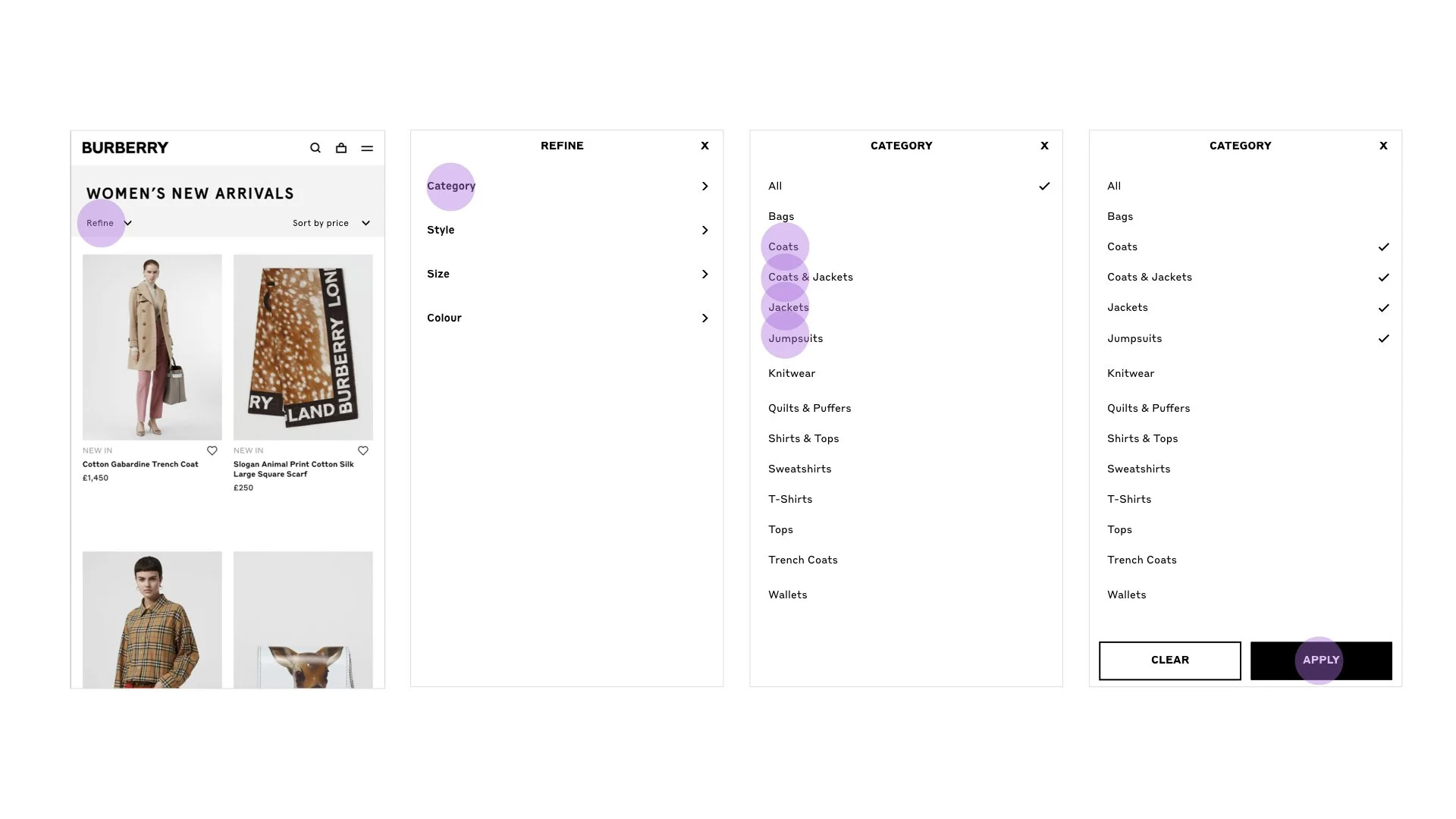
The final design
I worked on the final UI design and animation with another designer to deliver a luxury, seamless experience and help users find exactly what they want.
After the initial release, within 24 hours filter usage had increased across desktop and mobile.