BURBERRY
Shopping bag
Having delivered the the checkout experience during the website re-platforming, I pushed to launch the first AB test within checkout on Burberry.com. I wanted to investigate how we could increase CTR within the checkout funnel, validate what makes customers choose Burberry for their purchase, as opposed to well known department stores?
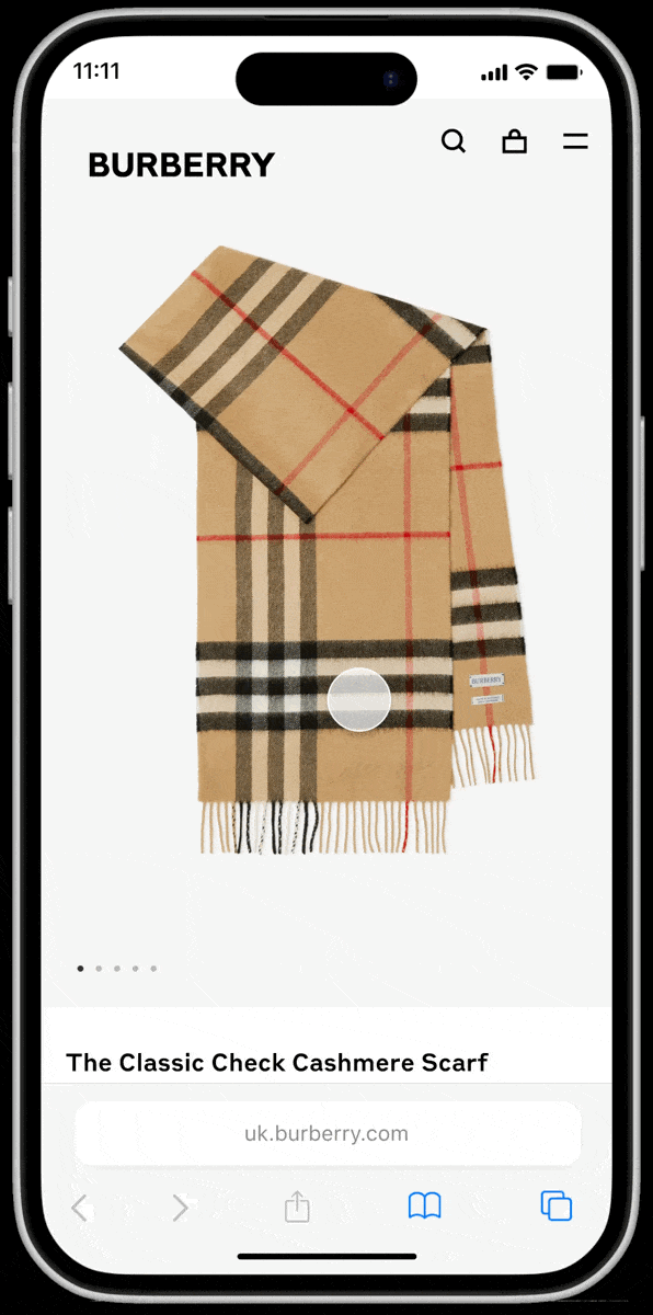
As top of the checkout funnel, and therefore more more data to investigate, the shopping bag was a strategic place to start.
Role
Product Designer
Key collaborators
Product Manager
Engineering
Analytics
Key pillars
01 Trust
02 Transparency
03 Simplicity
Gathering data insights
01 For users who do not reach the shipping page, most do not see the “Checkout” CTA
02 For users who do not reach the shipping page, most exit to the homepage
03 Users often click on unclickable elements
But why?
Through analysing ContentSquare, I had information on what was happening, but very little insight into why this was. I created two user tests which would help understand potential paths to improvement.
Test 01
Current web vs new design
As the re-platformed Shopping Bag page had just gone live as an AB test, I was able to test both the old-platform design, and new design to see if there was any difference in user habits and thoughts.
Objective
Understand the reasons behind the data (based on the replatformed design), and gather insights on any preferences between the two pages.
Test 02
Competitors
Objective
Gather insights on other sites, including features such as “bestsellers”, online to offline postcode look up, and personalisation. Existing sites gave a more realistic aspect to the tests, as opposed to creating multiple prototypes with these features.
Initial UT insights
“Being able to toggle between the shopping bag and browsing pretty easily is probably most important to me.”
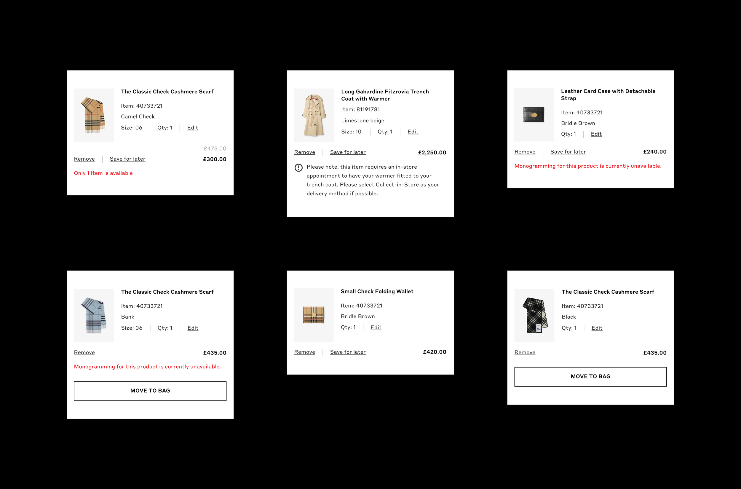
“This one doesn’t tell me what kind of shipping I’m getting”
“The search function is really important, being able to go to the payment quickly and continue shopping easily, amend my details easily.”
Workshopping ideas
Taking the initial insights from user testing, I facilitated a workshop to call out assumptions and pain points, separating the different aspects of shopping bag into themes we could take forward to improve, before creating HMW statements to address.
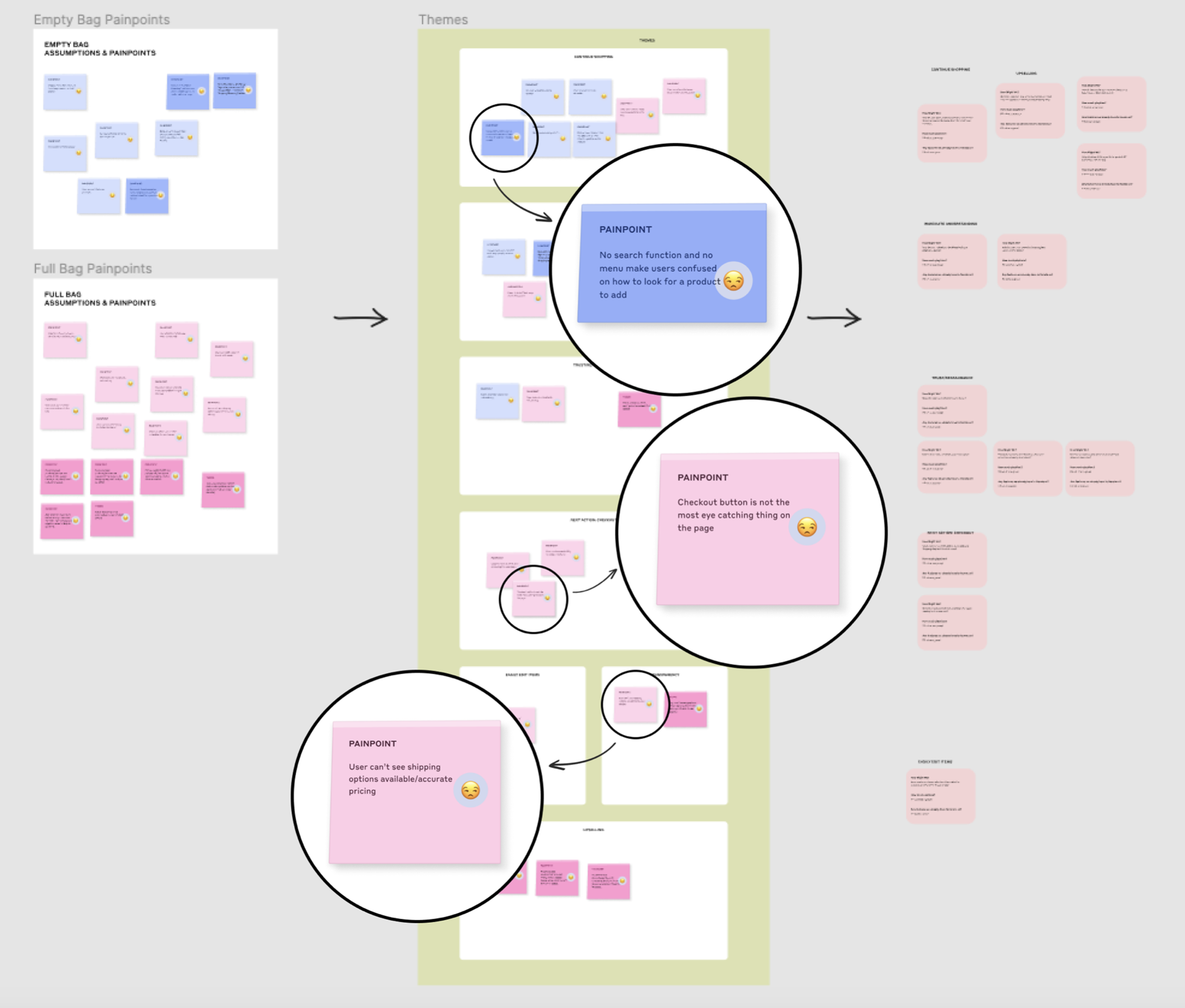
How might we…
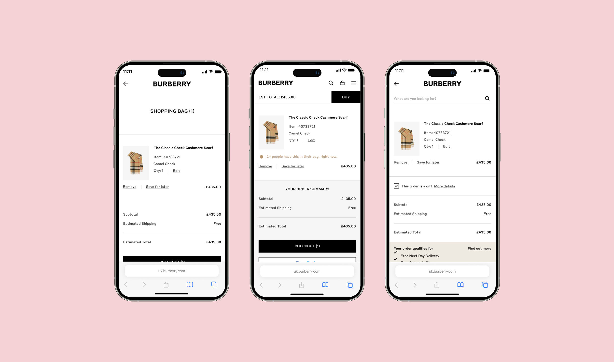
01 Remind the user of the primary action on the page: to proceed to checkout?
02 Help the customer easily understand how to switch between browsing and purchasing?
03 Be more transparent, showing all the information a user needs
Testing new design ideas
Test 03 Micro-insights
Objective
Observe and understand if the design ideas based on the initial user tests are viewed as improvements against the current site. Run as an unmoderated user test on usertesting.com.
Key areas to observe
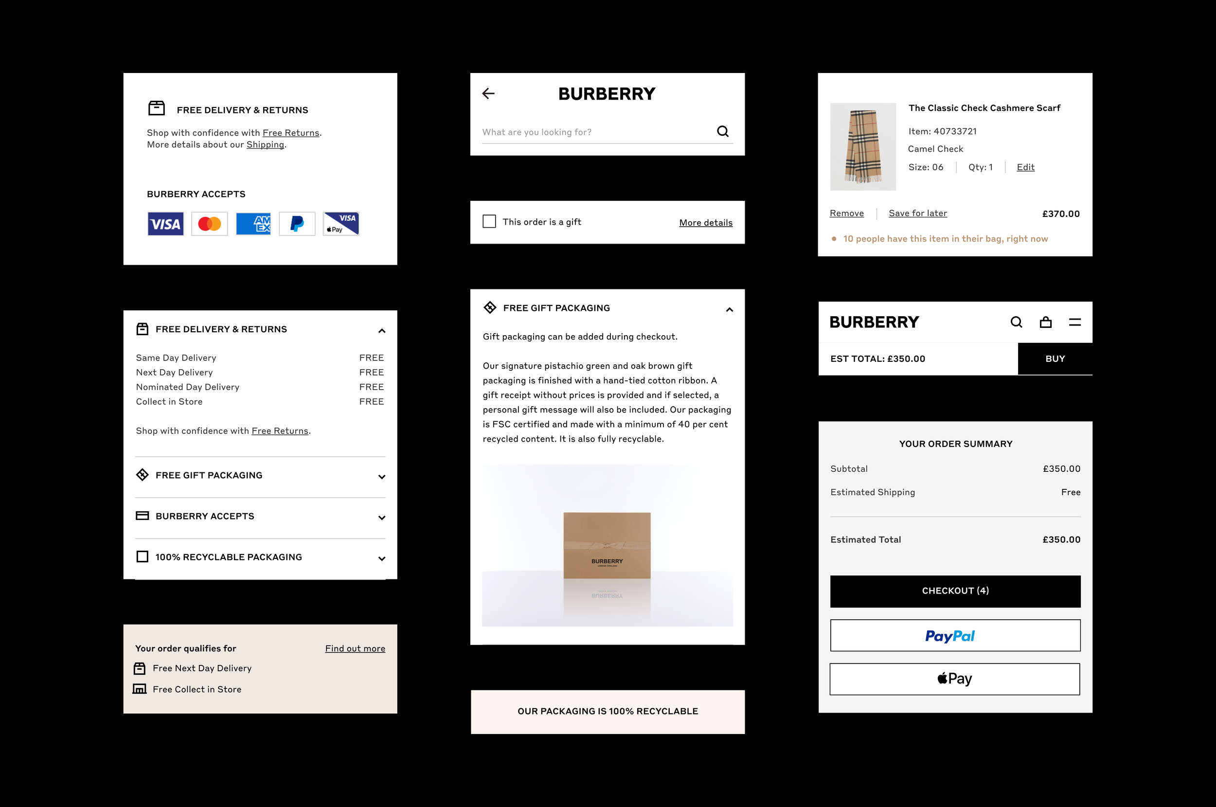
Delivery: exactly what kind of information are users looking for at the shopping bag stage?
CTA placement: where makes most sense for the user?
Navigation: does a customer understand how to continue browsing? Does the customer notice a change in navigation menu between browsing and purchasing?
Packaging: shopping directly with Burberry gives the user the option of luxury gift packaging. Does showcasing this have an affect on propensity to purchase?
Trending: are luxury customers interested in seeing “trending” or “best-selling” items?
Learnings
This test was interesting to see user reactions to the new design explorations, but next time I’d reduce the amount of small differences to get a clearer picture of the changes that would have the most impact for both the user and the business.
Key takeaways from test 03
01 Users don’t want to leave the shopping bag page to find further information.
02 Simplicity is key: users don’t want to think when they’re on this page. Colour helps them digest information.
03 Users called out the recyclable packaging as one of the most ‘eye-catching’ things on the new design.
04 “Estimated” next to the total could put customers off as they think there may be hidden costs.
05 Most users responded positively to the ‘10 people have this in their basket’ component, saying it provided reassurance other people were buying the same product. However, one buyer wouldn’t want to buy something everyone else has.
Design iterations
Test 04 Finalising direction
Objective
Gain insight and confidence in prototype improvements, with a final chance to gain feedback before creating the final AB test designs.
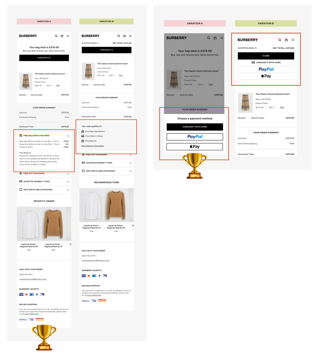
01 5/5 users preferred the CTAs at the bottom of the page, as they could review the information before continuing to the next step.
02 Customers preferred to open the accordions, it was clear they weren’t going to be taken away from the page in this design.
03 5/5 users felt confident in proceeding to purchase from this page.
Key improvements
The user testing provided key information ahead of designing and running the first AB tests on checkout, but there were also some aspects that could be improved immediately without further testing. I drove the implementation of these small but effective changes:
01 The back arrow takes users to their previous page, rather than the homepage
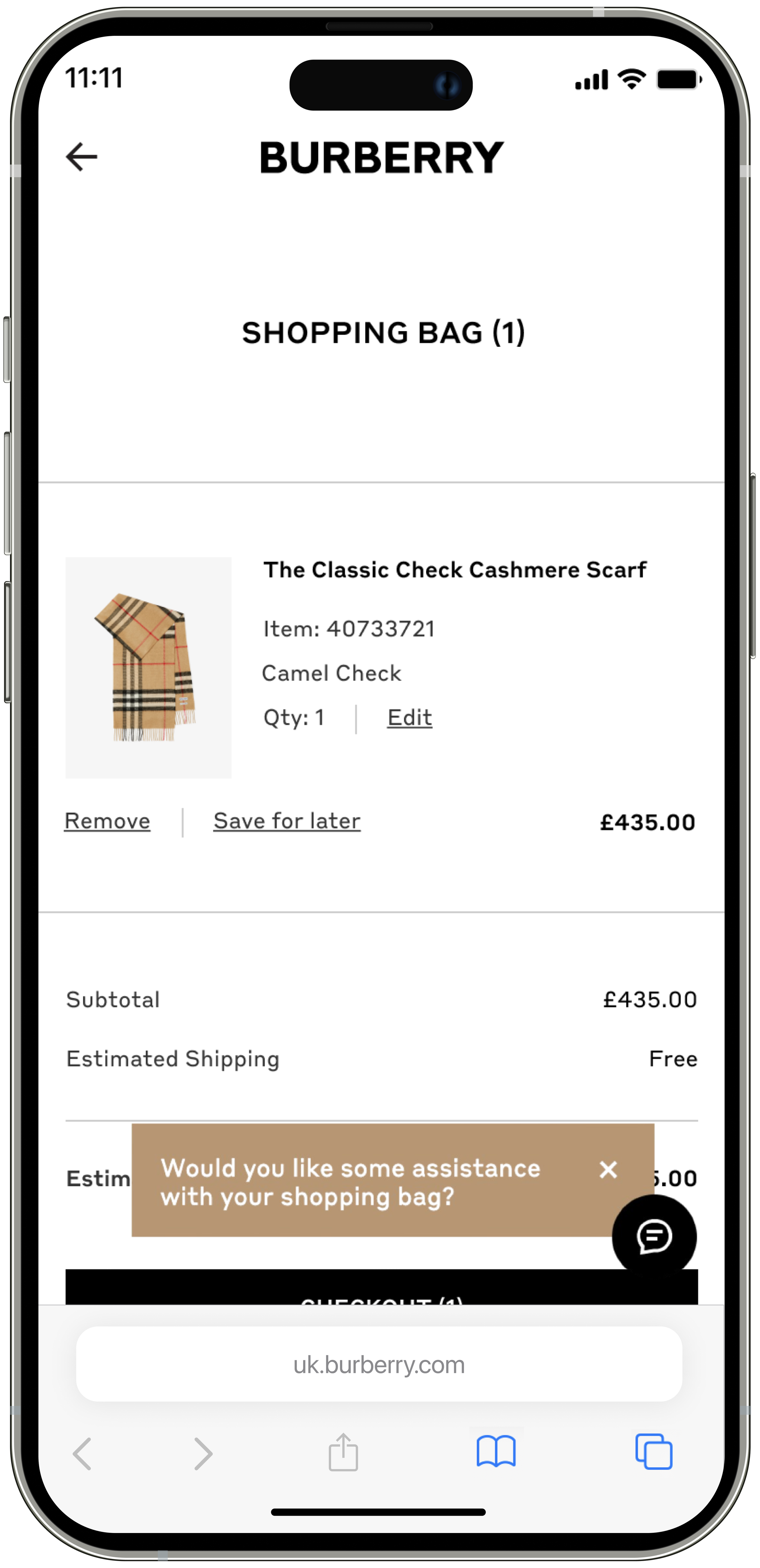
02 Live chat was deactivated on this page so it would not interfere with the checkout button (this was an insight I surfaced through user testing: our office wifi automatically hid live chat on the site)
03 “Estimated total” was updated to “Total” to give users confidence
04 Exact delivery type is shown in the order summary, based on domain
Final AB test design
Hypotheses
01 Making the checkout CTA sticky will help make the CTA more visible, and encourage users to proceed to the next step.
02 Adding accordions with additional delivery, packaging and returns information will give users confidence in proceeding to purchase on Burberry.com, improving step conversion.
While I delivered the final AB test, I left the company prior to results being shared.